Coastal Decor Trends In 30A Rental Homes
Light, durable, guest-friendly 30A decor: warm neutrals, subtle coastal accents, performance materials, and layouts that boost bookings.
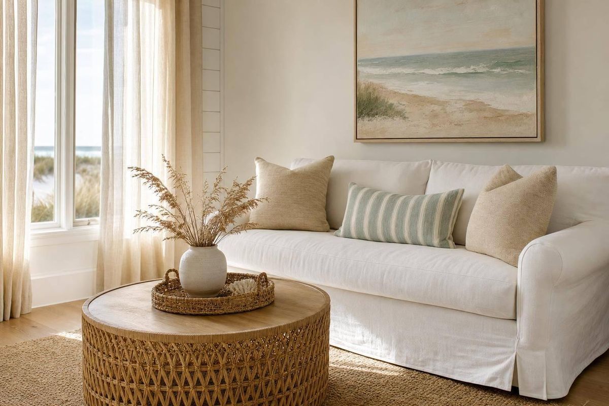
If I want a 30A rental home to book well now, I’d keep the decor light, simple, durable, and easy for guests to use. That’s the short answer.
Here’s the article in plain terms:
- Light colors win. Warm whites, sand tones, driftwood shades, and soft blue-green accents help rooms look brighter, larger, and cleaner in photos.
- Old beach-theme decor is out. Fewer shells, signs, and loud nautical pieces. More quiet beach cues through art, texture, and finish.
- Durability matters just as much as style. LVP flooring, performance fabrics, wipeable surfaces, and washable bedding help with sand, humidity, and back-to-back stays.
- Layout affects reviews. Clear walkways, group seating, usable dining space, entry storage, bedside tables, outlets, and blackout shades all shape the guest stay.
- Photos drive bookings. Listings with strong photos can see 24% more bookings and 40% more revenue per night, so decor choices need to look good on camera and hold up in person.
- Owner goals matter. Families, couples, remote workers, and large groups notice different things, so decor should match the type of guest the home is meant to attract.
My main takeaway: a 30A rental does better when it feels calm, clean, and easy to live in - not overloaded with beach decor.
| Focus Area | What works now | Why it matters |
|---|---|---|
| Color palette | Warm neutrals and muted coastal accents | Looks brighter in photos and feels clean |
| Beach details | Subtle art and natural textures | Keeps the home from feeling dated |
| Materials | LVP, performance fabrics, washable layers | Handles heavy guest use |
| Layout | Open flow, storage, usable seating | Helps comfort and review scores |
| Guest fit | Design for families, couples, or work stays | Supports occupancy and rate goals |
If I were cutting this down to one rule, it would be this: make the home easy to photograph, easy to clean, and easy for guests to use.
Designing & Decorating a Beachside Vacation Rental
sbb-itb-d06eda6
Light Palettes and Simple Beach Details Leading the Trend
Building on the pared-back look above, the clearest 30A shift right now is warmer, quieter color. In many rental interiors, the big move is toward warm, muted palettes: warm whites, soft creams, sandy beiges, driftwood grays, and muted blue-green accents. These shades feel calm, look clean in natural coastal light, and fit just as well for families as they do for couples on weekend trips or guests staying longer. A simple rule works well here: use warm neutrals across most surfaces, keep white for trim and bedding, and bring in muted blue-green accents sparingly so the space nods to the coast without turning into a theme.
Colors That Make Rooms Feel Brighter and Larger
Pale wall colors can make smaller rooms feel more open. Add light wood or whitewashed flooring, plus light upholstery in sand or oatmeal tones, and the daylight tends to move through the room more evenly. That matters in person, but it also matters in listing photos. Neutral light palettes are easier to photograph well and usually need less editing to look balanced, which helps keep the images closer to what guests will actually see when they arrive.
In high-traffic spaces like entryways and living rooms, light to mid-tone luxury vinyl plank (LVP) flooring in a driftwood or light oak finish is a smart pick. It looks bright and airy in photos, handles water and sand well, and hides day-to-day wear much better than dark hardwood or pure white tile.
Beach References That Feel Subtle Rather Than Themed
With coastal decor, less usually says more. The aim is to hint at the beach, not shout it. Abstract coastal art does that well. Soft bands of blue, sand, and white can bring to mind horizon lines or dunes without leaning on a literal beach print. Striped textiles in cream and driftwood gray, or soft blue and white, can echo cabana fabric while still feeling current instead of kitschy.
Ceramics work the same way. A matte white vase, a sand-colored bowl, or a hand-thrown piece in a sea-glass glaze adds texture and coastal color without covering every surface in decor that collects dust. Warm neutrals and driftwood tones feel current and photograph well. By contrast, bright primaries, dark woods, and stark white finishes tend to date a room faster and show wear more easily. In practice, that can be as simple as swapping a beach-rules sign for one framed local photo, or trading a rope lamp for a ceramic lamp in a sea-glass tone.
Once the palette is in place, natural textures can add depth without adding clutter.
Natural Textures That Fit 30A Style and Rental Durability
Texture gives 30A rentals depth without making them feel busy. The look that’s popular now pulls straight from the coast outside the door: dunes, weathered boardwalk wood, and sea oats. But in a rental, looks alone don’t cut it. These materials need to stand up to sand, humidity, and back-to-back guest stays.
Materials That Reflect Dunes, Sea Oats, and Driftwood
Rattan and wicker show up a lot in current 30A interiors. You’ll see them in accent chairs, barstools, and pendant lights. They bring a warm, straw-like texture that hints at dune grass, which helps rooms photograph well and stay easy to live with, without slipping into obvious beach-theme decor.
Rachel Moore says her 30A properties use sand-washed, nature-inspired materials that hold up to salt air and heavy guest use.
Woven baskets near entryways and in bunk rooms do two jobs at once. They add that dune-grass feel, and they give guests a place to drop flip-flops, beach bags, and towels. Jute-look synthetics work well in open living areas too, adding a sandy, tactile feel underfoot. A small number of natural-fiber pieces can add depth without making the room feel crowded.
Durable Finishes That Handle Sand, Humidity, and Turnover
Texture has to earn its place in a rental. Performance fabrics like Sunbrella, Crypton, and Perennials are close to standard now for sofas and sectionals in busy coastal homes. They’re made to repel liquids, resist stains and mildew, and take the wear that comes with peak-season turnover, while still looking soft and homey instead of commercial.
The main tradeoffs come down to comfort, cleanup, and wear over time.
| Item | Recommended Material | Rental Benefits | Maintenance Notes |
|---|---|---|---|
| Sofas | Performance fabric (Crypton, Sunbrella); optional slipcovers | Stain- and moisture-resistant; survives heavy use and frequent turnover | Blot spills right away; rotate cushions; deep clean from time to time |
| Rugs | Flat-weave cotton; indoor/outdoor polypropylene; jute-look synthetics | Easy to vacuum; handles sand well; coastal texture without bulk | Vacuum after each stay; spot clean fast; shake out smaller rugs |
| Dining Surfaces | Whitewashed solid wood with durable clear coat; high-pressure laminate | Driftwood look; resists daily wear; easy to wipe down | Use coasters; wipe daily with a mild cleaner; skip harsh abrasives |
| Bedding | Cotton percale or sateen sheets; washable cotton/linen-blend quilts; performance duvet covers | Comfortable in humidity; easy to wash between stays | Machine wash warm; tumble dry; rotate sets to help them last longer |
The rule across all of these choices is simple: sealed, wipeable, and easy to clean between stays.
Once the materials are in place, the next job is a layout that keeps rooms easy to move through and simple to reset.
Guest-Friendly Layouts That Support Comfort and Better Reviews
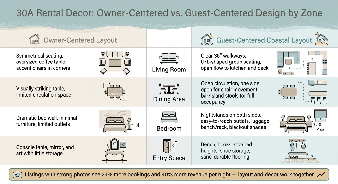
30A Rental Decor: Owner-Centered vs. Guest-Centered Design by Zone
Good materials and finishes can help a place look nice. But in 30A rentals, layout does more than that. It shapes how guests feel in the home, how easy turnovers are, and what shows up in reviews. Once a home has that coastal feel, layout is what makes it feel easy to use day to day.
Furniture Layouts That Improve Flow and Usability
A common mistake in owner-designed rentals is setting up the living room like a showroom. You see accent chairs pushed into corners for symmetry, oversized coffee tables taking over the middle of the room, and sofas aimed only at the TV. It may look polished in listing photos, but it often gets in the way of how people actually live.
Keep at least 36 inches of clear walkway between major furniture pieces. Seating should form a loose U or L shape so people can talk without feeling boxed in. It also helps to leave one side open to the kitchen and another to the outdoor deck. Think through the path from the bedroom to the kitchen to the deck, then keep that route clear. The same idea applies to the dining area.
Place dining areas off the main traffic path, and leave one side open so chairs can slide in and out without a struggle. Island or bar stools can also help a home live up to its stated occupancy at mealtimes, which matters a lot for multi-generational trips.
Storage and Comfort Details Guests Actually Notice
Bedrooms and entries are where guests tend to judge day-to-day ease the most. In practice, they notice bedside access, luggage storage, and light and noise control more than wall art. Nightstands on both sides of the bed, easy-to-reach outlets, a luggage bench or rack, and blackout shades in rooms with early morning sun are the kinds of details people mention in reviews when they’re missing.
At the entry, it often makes sense to swap a decorative console for items people will use right away:
- A bench
- Hooks at different heights
- Shoe storage
- Durable flooring that can handle sand and beach gear
The table below shows how owner-centered and guest-centered layouts differ across the four main zones of a 30A rental home.
| Space | Owner-Centered Layout | Guest-Centered Coastal Layout |
|---|---|---|
| Living Room | Symmetrical seating, oversized coffee table, accent chairs in corners | Clear walkways and group seating |
| Dining Area | Visually striking table, limited circulation | Open circulation and extra seating |
| Bedroom | Dramatic bed wall, minimal furniture, limited outlets | Nightstands, outlets, luggage space, shades |
| Entry Space | Console table, mirror, and art with little storage | Bench, hooks, shoe storage, durable flooring |
These layout choices should be weighed against target guest type and turnover demands.
Matching Decor Choices to Owner Goals and 30A Market Fit
With the palette, materials, and layout in place, each decor move should back up two things: the guest you want to attract and the rate you want to earn. Once the floor plan feels right, the decor should strengthen the kind of stay you're offering.
How Design Choices Align with Different Guest Types
Different guests notice different signals. That means the right decor choices depend on who books your place most often. Families tend to care about durable flooring and simple storage. Couples usually respond to clean sightlines, warm lighting, and good linens. Remote workers look for a quiet desk spot and natural light. Multigenerational groups need wide walkways and seating that can shift with the group.
Guests planning 30A trips through local guides like sowal.co often arrive with a clear picture in mind. They've already seen soft dune colors and quiet coastal details in their trip research. When a rental reflects that same look, the home feels connected to the trip they came for instead of working against it.
So these trends shouldn't be treated as style for style's sake. They're owner choices tied to positioning, guest fit, and income.
| Decor Trend | Primary Benefit | Likely Impact on Occupancy/Nightly Rate | Key Owner Trade-offs |
|---|---|---|---|
| Lighter Color Palettes | Broadens appeal | Supports stronger listing performance and rate positioning | Requires stain-resistant finishes; quality materials cost more upfront |
| Subtle Beach Details | Avoids a themed look | Broad appeal across guest types; supports brand differentiation | Ongoing curation needed to avoid clutter; unique pieces cost more |
| Natural Textures & Materials | Supports premium positioning | Strong photo impact; can justify higher nightly rates | Some materials less durable in humidity; may need sealing or performance alternatives |
| Guest-Centered Layouts | Better flow and usability for varied groups | Higher review scores; improved repeat and off-season bookings | Limits decorative furniture; may require reconfiguration |
| Work-Friendly Nooks | Supports remote workers and longer stays | Extends booking season; enables premium for workspace amenity | Space trade-off; investment in desk, chair, lighting, and outlets |
Conclusion: The Core Decor Trends Owners Should Focus on Now
Start with a lighter palette. It tends to improve listing photos and shape guest perception across almost every segment. From there, layer in natural materials that still hold up to sand, humidity, and back-to-back turnovers. Keep beach references subtle and deliberate. Then pressure-test every layout choice against how guests walk through the space, sit, unpack, work, and gather. The best-performing rentals get this balance right: style, durability, and a look that makes sense for 30A.
FAQs
What decor updates should I prioritize first?
Start with the basics that shape guest satisfaction most: comfort, cleanliness, and functionality. If reviews point to maintenance or housekeeping issues, fix those first. Those problems can hurt both occupancy and rental rates.
Next, put your attention on high-touch spaces like the kitchen and bathroom. Add durable, modern finishes. Upgrade to quality linens and better showerheads. And make sure the must-haves are covered, like fast Wi-Fi and smart locks.
Once that’s done, refresh your listing photos so they match what guests will actually see when they walk in.
How can I make a coastal rental feel updated without overdoing the beach theme?
Use a minimalist design with one clear color direction: about 50% neutrals like white, cream, and soft pastels, plus one or two accent colors.
Pick long-lasting finishes, such as brushed silver or matte black hardware. Go with hard-surface flooring to deal with sand more easily, keep surfaces uncluttered, and add a few luxury touches like plush linens and quality towels.
Which design choices matter most for bookings and reviews?
Prioritize upgrades that improve guest comfort, day-to-day function, and the overall stay. In reviews, guests tend to care most about the basics done well: high-quality mattresses, breathable bedding, and clean, spa-like bathrooms.
Layouts matter too. Homes with ensuite bathrooms, bunk rooms, and modern kitchens often do well because they make group trips smoother and less stressful.
A few guest-friendly touches can also help drive bookings and support higher nightly rates:
- High-speed Wi-Fi
- Keyless entry
- Smart-home tech
- Heated pools
- Golf carts
- Game rooms
- Professional photography
These upgrades don't just look good in a listing. They make the property easier to use, more fun to stay in, and more memorable once guests arrive.